In today’s digital age, having an accessible website is essential. However, it is often an afterthought in web design, with the latest visual effects prioritised over an accessible user experience. Over 1 in 5 people in the UK have a disability, and shockingly, a study has revealed that in a test of 1 million website home pages, 56,791,260 accessibility errors were found. This is an average of 56.8 accessibility errors per homepage, preventing disabled people from accessing content.
In this post, we will reveal why it’s important and how to check your website’s accessibility. We will also provide 11 easy tips outlining how to make a website accessible.
If you’re reading this post, thank you for taking the time to make accessibility a priority.

Why is Website Accessibility Important?
Website accessibility is not just a moral obligation. It is a game-changing component that unlocks your website’s potential to reach its maximum audience and contributes to a more inclusive world. An accessible website opens the doors for everyone, including those with visual, auditory, physical, speech, cognitive, and neurological disabilities. This inclusivity significantly widens the potential audience, reaching more users and potential customers.
An accessible website can also have some great business benefits. These include:
- Improved user experience for everyone
- Increased customer engagement and loyalty
- Improved SEO & search engine rankings
The above benefits can contribute to increased sales and enquiries.
Plus, have you heard of the Purple Pound?
This is the spending power of disabled people and their families, estimated at £249 billion per year. Without an accessible website, your business is likely missing out on this share.
How to Check Your Website Accessibility
There are many online tools available to check your website’s accessibility. Here are our top three recommendations. These free tools will help you find errors and inform you how to make your website accessible.
1. Wave Evaluation Tool (Browser Extention)
A simple extension tool developed by WebAIM.org. This tool places icons on your webpage, highlighting errors such as low contrast, missing alternative text, incorrect aria labels and heading/structure features that could be improved.
2. Silktide (Chrome Extension)
A favourite used by our web developers that gives you access to over 200 accessibility checks. Silktide features help guides for every issue found, plus screen reader and disability simulations so you can truly understand the barriers faced when navigating a website as a person with a disability.
3. Accessibility Checker
A free scanning tool that outlines critical issues. This tool highlights the failing elements/code, explains who this would affect and details how to solve it!
If you want to explore more tools, we recommend visiting the World Wide Web Consortium’s (W3C) Web Accessibility Evaluation Tools List.
11 Top Website Accessibility Tips
So, now that you understand why and how to check your website accessibility let’s dive into how to make a website accessible!
1. Get Familiar with Accessibility Principles
Firstly, get familiar with accessibility principles. This includes understanding the Web Content Accessibility Guidelines (WCAG), which provide a set of standards for creating inclusive websites and applications. We recommend viewing this simple list of accessibility principles.
2. Use Alternative Text (Alt Tags)
Make sure your images have descriptive alt tags. Alt tags are the written copy that appears in place of an image on a webpage, which screen readers will use to describe an image to visually impaired users. Most images on your website should have an alt tag, with the only exceptions being images that are solely decorative or already described in nearby text.
3 Tips for Writing Alt Tags
A strong alt tag needs to be specific and clearly describe the image. A few tips include:
- Make your alt tag less than 125 characters.
- Don’t include ‘image of’ or ‘photo of’ at the start of the alt tag.
- Convey the ‘WHY’ of the image and how it relates to the page content.
Let’s take a look at an example for the image below, and you can convey the context of images for various types of web pages.

Alt-text with no content:
A female working on a double-screen monitor showing code.
Alt-text on a page about web design:
A female web designer, working on a double-screen monitor showing code in the Solve Office.
Alt-text on a blog about web accessibility:
A female web designer writing accessible code on a double-screen monitor in the Solve office.
3. Check Colour Contrast
Colour contrast is important for those with visual impairments; text can be difficult to read if the contrast between the text and background is not high enough. The WCAG recommend a colour contrast of 4:5:1 for normal text, 3:1 for large text and 3:1 for graphics. It should also be noted that anything indicated by colour should have an alternative way it can be distinguished – for example, asking a user to “use the blue button to say yes or the green button to say no” may cause problems for some users who are unable to tell the difference between the two colours.
Examples of Good and Bad Colour Contrast
Below are two examples, one of bad and one of good colour contrast.

An example of bad colour contrast. The yellow background paired with the pink writing makes it difficult to read the text. This scores just 1.05:1 for colour contrast.

An example of good colour contrast. The navy background paired with the white writing makes it easy to read the text. This scores 15.84:1 for colour contrast.
Tools To Test Colour Contrast
You can use WebAim’s colour contrast checker. Simply input the colour HEX codes and you will receive a contrast ratio rating as well as a ‘pass’ or ‘fail’ reading. Alternatively, you can use the Colour Contrast Checker Chrome extension. This allows you to use the colour picker tool to compare colours on a webpage, as well as quickly reverse background and foreground colours.

4. Use Descriptive Link Text
Link text refers to text that has a link embedded within it. It is important not to use terms such as ‘Click Here’ for link text, as this makes it unclear where the link takes the user; this is especially important for visually impaired users. Instead, use descriptive link text such as ‘Learn More About Alt Tags’ or ‘Register For Our Upcoming Accessibility Webinar.’ This enables users who use screen readers and assistive technologies to understand the purpose of the link. Plus, descriptive link text can also boost your SEO as it provides context and keywords to search engines.
5. Ensure Your Website is Navigable by Keyboard
Make sure that website functionality, content and features can be navigated by a keyboard. This is important as some users may be unable to use a mouse due to physical disabilities. To be keyboard accessible, users need to be able to navigate your site using the tab key and use interactive elements using the enter or space keys. It is important that the tab order is logical and follows the visual order of the page, as well as that there is a visible focus indicator that highlights elements to show which is selected.
How To Test Keyboard Navigation
Testing this out couldn’t be easier – just try it yourself! The main keys that should work on your website are:
- Tab key for moving through elements
- Shift-tab to go back
- Enter and/or space to select elements
Using this, take your hand off the mouse and see how easy it is for you to get around. Some questions to ask yourself might be:
- Do the keys work as they should?
- How easy is it to get down a page? Is it ordered and does it miss any elements?
- Is it always clear where you are on the page?
- Are you able to use all website features, such as forms and dropdowns?
6. Use Headings & Subheadings
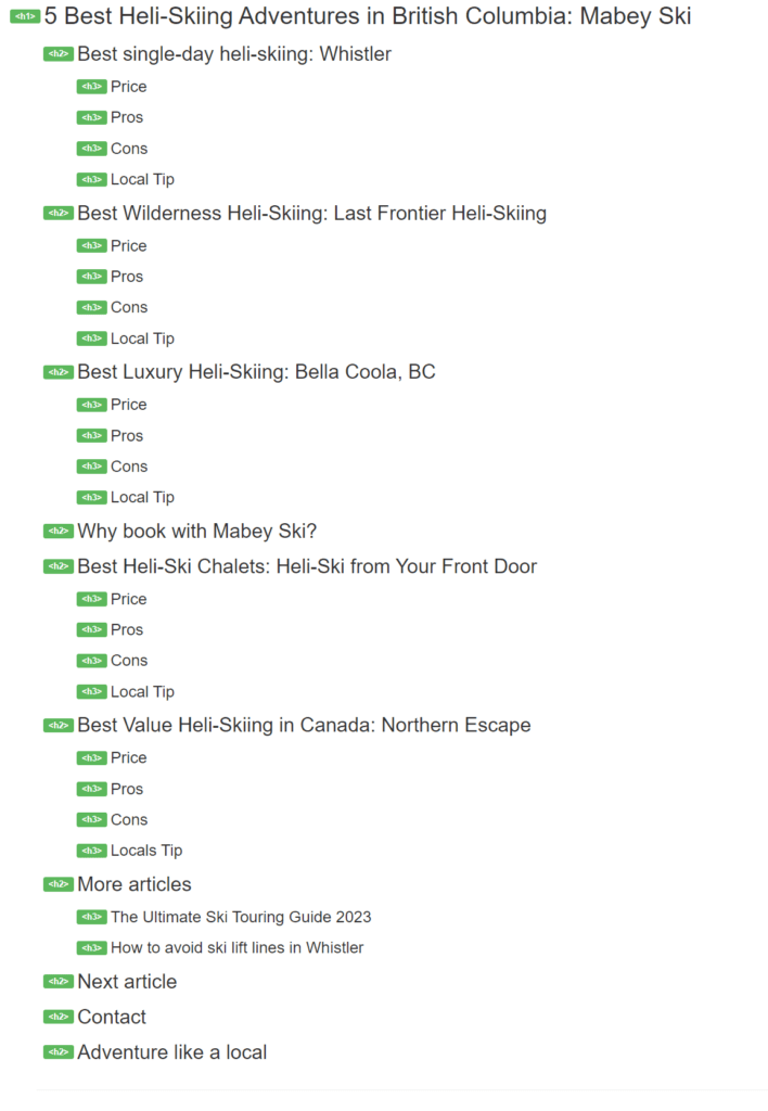
At Solve, we always suggest a solid heading structure. This starts with an H1 title and a hierarchical structure for H2 and H3 headings. This provides information to search engines crawling your site for information. However, good content structure isn’t just great for SEO; it’s also fantastic for accessibility!
Subheadings and headings break up content, making reading easier for users with visual impairments and cognitive disabilities to understand and navigate. They also benefit website visitors using screen readers, allowing quick content navigation.

7. Add Video Captions & Transcripts
Add video captions and transcripts so that deaf or hard-of-hearing users can understand the information presented. Captions provide a text alternative to audio content and come in two forms: open and closed captioning. Open captions are part of the video file and cannot be turned off (e.g. auto-generated captions on Instagram reels).
Closed captions are created separately from the video file, usually in an SRT format, and can be turned on or off by users (think optional subtitles on Netflix). Open captions usually capture speech, while closed captions feature speech and other information, such as sound effects and tone.
You may also want to provide a transcript. This is a written copy of the audio content, which can be helpful for users wanting to read the content at their own pace.
Studies have shown that captions support those who are deaf or hard of hearing. In fact, one study showed that captions can benefit everyone who watches videos, including children, adolescents, college students, and adults.
How to Create Video Captions & Transcripts
Video captions are usually added when you upload your video to a platform, such as Instagram, TikTok, or YouTube. These days, most video platforms have the option to create automated captions, which can often be exported as transcripts. While automated captions are efficient, they are not 100% accurate, so double-checking spelling and whether they are in sync with video content is advised. Many platforms have on how to add video captions, such as this Google guide for adding captions and subtitles to YouTube videos and this guide from Vimeo.
8. Avoid Overusing Dynamic Content
Dynamic content changes based on a user’s behaviour, preferences, or actions and external factors such as time, location, or device used. Examples include pop-ups, screen overlays, autoplay videos, and customised messaging. It is widely used on modern websites to add a layer of interactivity, add a personal touch and adjust content in response to users’ actions.
However, when content updates dynamically without the page refreshing, it can cause accessibility problems. For example, users with screen readers may not be aware of things changing on the page if it does so without a page refresh. Not only this, but keyboard-only users may become stuck in page overlays, have difficulty turning video sound off and closing popups.
Users with screen magnification software could be zoomed into the wrong section of the page, and users with visual or cognitive impairments who rely on predictable and consistent content layouts and structures may struggle to use the site. To fix these issues, it is important not to overload your website with dynamic content and to check how dynamic content performs on website accessibility checkers.
9. Use Aria Roles & Attributes
Aria roles provide semantic meaning to elements, allowing assistive technologies to interpret and navigate the content. Attributes like aria-label and aria-describedby can be used to provide additional information or context to assistive technology users. We recommend using an experienced web developer to help you check and add Aria roles and attributes to your website.
10. Use Simple Language
Complex language can be difficult for those with cognitive disabilities to understand. Strive to keep your language clear and simple so that everyone can understand. Let’s take a look at an example below…
Complex Language
Website accessibility is a crucial factor in website design, development, and optimisation. It can be determined using quality tools such as the Web Evaluation extension and the comprehensive toolkit provided by the World Wide Web Consortium.
Simple, Clear Example
Website accessibility is important in website design. You can use the Web Evaluation extension tool to check your website’s accessibility, as well as W3C’s toolkit.
11. Check Your Website Forms
Often, those with disabilities find it difficult to access forms websites. Forms are a key conversion and lead generation function, and common accessibility issues include:
- Insufficient instructions: Users with visual impairments or cognitive disabilities may have difficulty completing a form if they cannot see the fields or understand what information is required. Providing clear labels and instructions can help users understand how to complete the form.
- Insufficient colour contrast: This is a commonly seen issue on forms, especially when the colour changes to highlight a selected option on a list.
- Difficult controls: Many forms contain options using sliders or popup menus, which can be difficult for some users to use. Where possible, using controls like text boxes or checkboxes can make forms more accessible.
Website Accessibility Examples
Purple Goat – Disability Marketing Agency Website

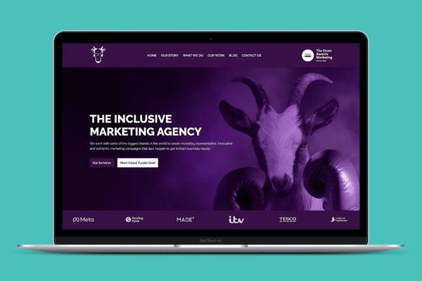
This website was built on the Solve IO framework, and our expert developers set tab index attributes, which make Purple Goat’s website super easy to navigate by keyboard. Users can successfully navigate the menu options using the tab key, submit forms using the enter key, and visit other site links. Suitable colour contrast was applied to all text and images throughout the site, and alternative text was added to the images. The website has a robust
heading and content structure and uses descriptive link text such as ‘View Case Study.’
Want to test it out? View our Purple Goat Transformation page to find out more!
Nansledan Community Website

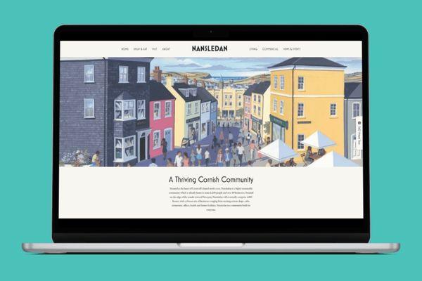
Again, this website was built on the Solve IO framework. Users can easily navigate the site using the tab key, which moves through each of the menu items and sub-menu items. Our pixel-pushing web developers also developed a custom alt tag generator function, which automatically adds alt tags to images from image file names.
Want to check it out? View our Nansledan Transformation page to explore!
Web Accessibility Made Easy
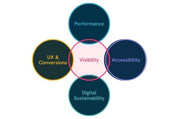
At Solve, accessibility is not an afterthought; it is woven into our web design process from the start of every process. Our bespoke Solve framework features accessibility as one of our key pillars to building a successful website. We are passionate about designing websites with solid foundations, considering visibility, performance, accessibility, sustainability, user experience and conversions as core components of each project.

If you’re looking for an accessible website build, contact Solve today.
Our web developers have expert knowledge and training on website accessibility.
If you’re looking to make your whole business more accessible, you might also want to check out our friends over at Purple Goat – the world’s first and only disability-focused marketing agency. They offer fantastic inclusive marketing services such as DE&I training and influencer marketing.

Get help building an accessible website today and propel your business to online success.
Speak to Perry – One of Our Web Development Experts.


