
Have you ever landed on a website and before you’ve even read a word, you already feel tired?
A pop-up asks for your email. A chat bubble slides in. A banner counts down a “limited time” offer. Somewhere below, three different sections are all vying to be the one you click. Nothing on the page is broken. Everything technically works. And yet you close the tab.
That feeling has a name: UX fatigue. It isn’t caused by bad design in the traditional sense; it’s caused by too much of what we’ve been taught is good design, all switched on at once. Interfaces stop feeling helpful and start feeling like attention-grabbing annoyances.
The response to this, gathering pace across 2026, is something the industry has started calling calm design. This approach treats user attention as the scarcest resource on the page and recognises that people are distracted, running on reduced focus, and increasingly suspicious of interfaces that feel engineered to manipulate them.
We asked Sofie, one of our designers here at Solve, to unpack why this shift is happening and what it means for anyone building a website in 2026.
Table of Contents

Users Aren’t Lacking Features. They’re Lacking Energy.
For years, the trend in web design was to extract as much as possible from every visitor in a single visit. Trust signals, CTAs, pop-ups, lead magnets, exit-intent offers, all stacked onto a page to squeeze out one more conversion.
As Sofie puts it, that approach is starting to backfire:
“Users are already overloaded. Between social media, emails, adverts and constant notifications, there is a real fatigue from being asked to click, sign up and engage all the time. If a website immediately asks too much without first giving value, it creates friction instead of trust.”
Sofie compares it to a relationship. If someone constantly asks things of you without offering anything back, you eventually disengage. Users are starting to treat brands the same way. A homepage that opens with three asks before it’s offered a single answer isn’t building trust; it’s doing quite the opposite.
The business case for fixing this is concrete. Every extra click, every confusing layout, every irrelevant notification chips away at conversion rates, onboarding completion and subscription renewals. The companies growing fastest right now are the ones removing the features that don’t earn their keep. A simple, clean UX strategy creates an advantage in a noisy and otherwise overwhelming space.
AI Is Making UX Fatigue Worse
You’d think AI tools would help by generating cleaner layouts faster. In practice, Sofie sees the opposite happening.
“AI is amplifying this problem because it tends to apply every ‘best practice’ at once, giving equal weight to everything: testimonials, newsletter sign-ups, product pushes, social proof and FAQs, without understanding hierarchy. But good UX is about prioritisation. Not everything can be equally important. If everything is shouting, nothing is heard.”
An AI-generated layout will happily include every proven conversion element on a single page, because each one is individually a “best practice.” What it won’t do on its own is look at it holistically and ask the harder question: what is the single most important action we want from this user? That’s the question Sofie starts with on every project. Once the ‘lead role’ question is answered, everything else on the page becomes supporting cast.
Not only this, but using a multitude of plugins and AI tools on your website will also bloat your web pages and slow your website down considerably. See here for why page load speed is important for SEO purposes and human interaction alike.

White Space Isn’t Wasted Space
There’s a recurring pattern Sofie sees with clients: a fear of empty space. If there’s room on the page, the instinct is to fill it, another banner, another testimonial, another box.
“White space is not wasted space. It creates clarity, focus and breathing room. Simplicity often performs better because it reduces decision fatigue.”
The same principle shows up in products and apps. People increasingly gravitate toward tools that do one thing well over bloated platforms crammed with features they’ll never use.
Why Good Websites “All Look the Same” (And Why That’s a Good Thing)
It’s a common criticism: every website has navigation at the top, a hero section first, then a predictable flow of content below. Doesn’t that mean everyone’s just copying each other?
Not quite, says Sofie. Familiar layouts exist because they reduce cognitive friction.
“If every website reinvented navigation or interaction patterns, users would have to relearn how to use the internet every time they landed on a page. In Western cultures, we read left to right and tend to scan pages in F or Z patterns, which is why many websites follow similar structures. These patterns are not lazy, they are functional.”
The same logic applies to iconography. A cog means settings. A chain means a link. A pin means location. These conventions work in the same way airport signage works: instantly understood, without a second of translation. Break that expectation, and you create friction.
Convention lives in the functional structure; personality lives everywhere else. Brands can still express themselves fully through colour, typography, imagery and tone. The strongest website design gets both right at once.
Whilst convention is important, it’s crucial to also remember that not everyone perceives or interacts with technology the same way. Building a website that considers UX accessibility is essential for creating a space that is functional for a wide range of users, without leaving anyone behind.
Good Simple Website Design Is Invisible
Perhaps the clearest test Sofie applies to any project:
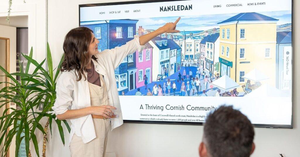
“If someone uses a website without noticing the design because everything feels intuitive, that is success. Simple website design wins every time.”
Good UX often means saying less, guiding more clearly and trusting that if a product or service is genuinely strong, it doesn’t need to constantly oversell itself on every scroll.
A website built around a business goal is a website with purpose. Every element earns its place. The user experience is shaped by what your audience needs to feel confident enough to act. The technical foundations support speed, discoverability, and conversion – because those things directly affect your bottom line.
The Bottom Line
UX fatigue is a response to years of interfaces asking more of users than they have left to give. Calm design isn’t about stripping websites bare for the sake of it. It’s about prioritisation: deciding what actually matters on a page, giving it room to breathe, and trusting familiar patterns to do the quiet work of making everything feel effortless.
If your website feels like it’s shouting to be heard, the fix probably isn’t more content. It’s usually less, arranged with more intention.
Solve is a Certified B Corp digital growth agency based in Newquay, Cornwall, specialising in SEO, content creation and web design that’s built to perform, not just look good.

If your website is doing too much and converting too little ,get in touch with the team to talk about a calmer, more intentional redesign.
Speak to our MD, Perry
Frequently Asked Questions
What is UX fatigue?
UX fatigue is the mental exhaustion users feel from interacting with interfaces that are technically usable but overloaded with competing prompts, animations, pop-ups and calls to action. It’s caused by too many features applied without hierarchy.
What is Calm Website Design?
Calm design is an approach to UX that prioritises clarity and restraint over persuasion tactics. It treats user attention as a limited resource and focuses on removing friction, rather than adding features or prompts, to help people complete tasks with less effort.
Does simple website design actually improve conversion rates?
Yes. Reducing unnecessary clicks, competing calls to action and irrelevant pop-ups tends to improve conversion rates, onboarding completion and renewal rates, because it reduces the decision fatigue that causes users to disengage or abandon a task.
Why do so many websites look similar?
Familiar layouts, navigation at the top, a hero section first, a predictable content flow, reduce cognitive friction. Users scan pages in learned patterns (commonly F or Z shapes in left-to-right reading cultures), so consistent structure helps people find what they need faster, rather than reflecting a lack of originality.
Is AI making website design worse?
AI can make UX fatigue worse when used without editing, because it tends to apply every recognised best practice at once without understanding which elements should take priority on a given page. AI-generated layouts often need to be stripped back to a single clear priority, with supporting content deliberately de-emphasised.