Website main menu’s are one of the most vital elements on any website, helping users navigate through websites efficiently in turn helping SEO, conversion rate, UX, accessibility and search engine crawlers understand your website.

So why?
Including home in your main menu could be a conscious or unconscious decision, most website owners tend to put ‘Home’ in the menu out of habit. We’ve been placing ‘Home’ in the navigation since the beginning of time, but what’s the reasoning why we as website owners do this?
Learn the Psychology behind the ‘Home’
Signposting
When a user arrives on your website they might not land on the homepage, therefore they’re wanting to gain an understanding of where they are on your website. Human psychology has always been this way, we’re built to be curious. This is a biological function underpinning motivation for decision-making and is why a bold prominent menu is super important to grab the users attention.
So you’ve got their attention, what next? Users will typically briefly glance at your menu items, considering their significance in relation to what they’ve searched and what page they’ve landed on, but also they’re able to conclude an decision of what the website is about through those all important menu items and this is where you need to summarise what you do through those menu items.
Example
A great example would be if I had a travel guide I would have great top level pages such as ‘Locations’, ‘Food & Drink’, ‘Activities’ and ‘top things to do’. Using this example let’s say someone is looking for a bar in an area I cover, they’ll land on the Newquay bar page if they’ve not found the information they need they will look for other bars in the area where the ‘Food & Drink’ menu item would be a great selection for that user.

If we had the menu displayed like this it attracts the eyes away from what’s important on the menu when using the example above.

But if we had the menu displayed like this then all the important pages you want users to visit will be at the users navigation focus.
Mental Model
Mental models are active when a user visits your website gathering a mental image of what your business and website is about. Our brains have been developed over thousands and thousands of years to make judgements based on the information given in front of us. This has stems all the back back to our survival era, when dinosaurs we’re plodding around and it was in our best interest we would run for cover without an absolute answer because it was life and death.
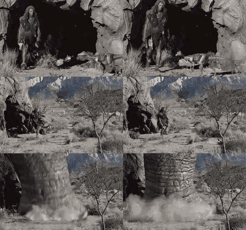
We’re lucky that dinosaurs don’t exist anymore but that same psychology is still with us in the modern and can be the difference between gaining a customer or losing one. Keeping ‘home’ in the menu navigation provides users with an opportunity to see a holistic website overview as your homepage will likely cover everything you do as a business. Your homepage unknowingly installs confidence in your visitors. Their unconscious thoughts intrude and because it’s the ‘normal’ to have a homepage they trust you, just like if a house didn’t have a good foundation, likely you wouldn’t trust its integrity it at all.
User Journeys
Right or wrong, we as website owners always assume all our traffic comes to the homepage. This is 100% not the case. We like to think this way because for example, coming in the front door is normal, again psychology has always pointed towards having one entrance and one exit. Again this is deep rooted in our brains, from the dinosaur era, where we would create one entrance to ensure safety at all times and avoid getting attacked from behind.

In the modern day we still use this method, our houses, flats, offices, bungalows have only one entrance and exit for the exact same reasons we did all those years ago, avoiding potential danger. This thought process has been passed across to the internet. Now, let’s bring it back to acquiring traffic, the realistic user journey for a website can start on any page that a search engine has indexed.
When a user starts a journey on any other page apart from the homepage, its important to note they might want to easily navigate to your ‘Home’ so psychologically they feel safe and can return to the homepage when needed. This reassurance gives them a second chance to start their journey on your website again and another moment to reintroduce the business to the user.
Clickable Logo
Menu website design will always feature a logo, usually at the top left and serves as a link back to the homepage which a significant amount of users recognise that will take them back to the homepage but equally it’s important to note that not all users acknowledge this as universal.
According to a usability report from 2015, a study conducted how the candidates would navigate to the homepage from an internal page. The result ended in approximately 50% using the navigation menu and 36% using the company logo to return to the homepage.

Which brings us to the point that while some visitors are aware of clicking the logo to go home, approximately 66% of users do not realise they can click to go back. Although this study was conducted in 2015, almost 9 years ago and the internet has evolved into what it is today. Along with the ever changing technology which was super powered by COVID-19 and caused UK adults to spend 22% more time on the internet, it developed a whole era of superpower coding geniuses that gave those people who we’re fond of the internet a big chunk of time to get comfortable with using websites.
It’s also important to remember, if your audience is younger they have likely always had access to the internet and know its ins and out, whilst the older audience may not be the best at using the internet.
Concluding the clickable logo, until we have another study and see what impact it has we would recommend testing it out on your website using Hotjar or Google Tag Manager to see how your audience navigates your website as every audience is slightly different.

